
Responsive form
Responsive form nhìn chung đơn giản hơn so với responsive table, nội dung của form thường sẽ được sắp xếp theo chiều dọc, nên cách responsive của form sẽ tương tự như cách responsive table dọc.
Thông thường form sẽ có 2 dạng:
- Dạng
<label>sẽ sắp xen kẽ với nội dung nhập liệu (dạng đơn giản) - Dạng
<label>sẽ sắp bên trái, nội dung nhập liệu sẽ sắp bên phải (dạng table dọc)
Responsive với form đơn giản
Tạo một form đơn giản sau:
HTML viết:
<div class="info">
    <form action="" method="">
        <dl>
            <dt><label for="name">Name</label></dt>
            <dd><input type="text" name="name" id="name"></dd>

            <dt><label for="name">Email</label></dt>
            <dd><input type="email" name="email" id="email"></dd>

            <dt>Gender</dt>
            <dd>
                <input type="radio" name="gender" id="male" value=""><label for="male">Male</label>
                <input type="radio" name="gender" id="female" value=""><label for="female">Female</label>
                <input type="radio" name="gender" id="other" value=""><label for="other">Other</label>
            </dd>

            <dt>Language</dt>
            <dd>
                <input type="checkbox" name="english" id="english" value="english"><label for="english">English</label>
                <input type="checkbox" name="japanese" id="japanese" value="japanese"><label for="japanese">Japanese</label>
                <input type="checkbox" name="korean" id="korean" value="korean"><label for="korean">Korean</label>
                <input type="checkbox" name="vietnamese" id="vietnamese" value="vietnamese"><label for="vietnamese">vietnamese</label>
            </dd>

            <dt><label for="message">Message</label></dt>
            <dd><textarea cols="50" rows="10" name="message" id="message"></textarea></dd>
        </dl>

        <p><button type="submit">Submit</button></p>
    </form>
</div>
CSS viết:
input[type="text"],
input[type="email"],
textarea {
    padding: 5px 0;
    width: 500px;
}

.info {
    margin: 0 auto;
    width: 600px;
}

.info dl {
    background-color: #f3f3f3;
    padding: 10px 30px 15px;
}

.info dl dt {
    font-weight: 600;
    padding: 10px 0;
    text-transform: uppercase;
}

.info dl dd {
    margin-bottom: 15px;
}

.info p {
    text-align: center;
}

.info p button {
    background-color: #666;
    border: none;
    border-radius: 4px;
    color: #fff;
    height: 36px;
    text-align: center;
    width: 100px;
}
Hiển thị trình duyệt:
Với form dọc như trên, ta responsive cũng đơn giản, ta cần quan tâm chiều rộng của form sao cho màn hình nhỏ có thể hiển thị tốt, chủ yếu chú ý tới các thành phần con bên trong, khi responsive vẫn giữ nguyên ý nghĩa là được.
CSS viết lại như sau:
input[type="text"],
input[type="email"],
textarea {
    padding: 5px 0;
    width: 100%;
}

.info {
    margin: 0 auto;
    width: 600px;
}

.info dl {
    background-color: #f3f3f3;
    padding: 10px 30px 15px;
}

.info dl dt {
    font-weight: 600;
    padding: 10px 0;
    text-transform: uppercase;
}

.info dl dd {
    margin-bottom: 15px;
    margin-left: 0;
}

.info p {
    text-align: center;
}

.info p button {
    background-color: #666;
    border: none;
    border-radius: 4px;
    color: #fff;
    height: 36px;
    text-align: center;
    width: 100px;
}

@media only screen and (max-width: 640px) {
    .info {
        max-width: 600px;
        width: auto;
    }

    .info dl {
        padding: 10px 20px 15px;
    }

    .info p button {
        width: 50%;
        min-width: 200px;
    }
}
- Với code bên trên, ta đã thay đổi chiều rộng các thành phần
input[type="text"],input[type="email"],textareatheo tỷ lệ phần trăm, để các thành phần này có thể linh hoạt theo chiều rộng của màn hình. - Ở những màn hình nhỏ hơn 640px, ta điều chỉnh thành phần
.infosao cho chiều rộng sẽ tự động theo màn hình, nhưng vẫn giữ giá trị chiều rộng lớn nhất là 600px để đảm bảo chiều rộng không được quá lớn. - Với button, trên giao diện nhỏ, ta cần phóng to cho người dùng dễ nhấn (touch), do đó ta tăng chiều rộng 50%, và đảm bảo chiều rộng tối thiểu 200px, để tránh trường hợp màn hình quá nhỏ sẽ làm cho button nhỏ theo.
Với code trên, ta được kết quả sau:
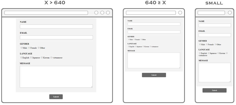
Click ví dụ responsive form dọc để xem kết quả.
Responsive form với dạng table dọc
Cho một form với dạng table dọc như sau:
HTML viết:
<div class="info">
    <form action="" method="">
        <table>
            <tr>
                <th><label for="name">Name</label></th>
                <td><input type="text" name="name" id="name"></td>
            </tr>

            <tr>
                <th><label for="name">Email</label></th>
                <td><input type="email" name="email" id="email"></td>
            </tr>

            <tr>
                <th>Gender</th>
                <td>
                    <input type="radio" name="gender" id="male" value=""><label for="male">Male</label>
                    <input type="radio" name="gender" id="female" value=""><label for="female">Female</label>
                    <input type="radio" name="gender" id="other" value=""><label for="other">Other</label>
                </td>
            </tr>

            <tr>
                <th>Language</th>
                <td>
                    <input type="checkbox" name="english" id="english" value="english"><label for="english">English</label>
                    <input type="checkbox" name="japanese" id="japanese" value="japanese"><label for="japanese">Japanese</label>
                    <input type="checkbox" name="korean" id="korean" value="korean"><label for="korean">Korean</label>
                    <input type="checkbox" name="vietnamese" id="vietnamese" value="vietnamese"><label for="vietnamese">vietnamese</label>
                </td>
            </tr>

            <tr>
                <th><label for="message">Message</label></th>
                <td><textarea cols="50" rows="10" name="message" id="message"></textarea></td>
            </tr>
        </table>

        <p><button type="submit">Submit</button></p>
    </form>
</div>
CSS viết:
input[type="text"],
input[type="email"],
textarea {
    outline: none;
    padding: 5px 0;
    width: 100%;
}

.info {
    margin: 0 auto;
    width: 600px;
}

.info table {
    background-color: #f3f3f3;
    padding: 20px 30px 15px;
    width: 100%;
}

.info table th {
    font-weight: 600;
    padding-bottom: 20px;
    text-align: left;
    text-transform: uppercase;
    width: 25%;
}

.info table td {
    padding-bottom: 20px;
}

.info p {
    text-align: center;
}

.info p button {
    background-color: #666;
    border: none;
    border-radius: 4px;
    color: #fff;
    height: 36px;
    text-align: center;
    width: 100px;
}
Hiển thị trình duyệt:
Với form như trên, ta có thể dùng cách đã làm với table dọc để xử lý responsive, tuy nhiên, cần chú ý các thành phần bên trong form, tránh làm vỡ giao diện.
CSS viết như sau:
input[type="text"],
input[type="email"],
textarea {
    outline: none;
    padding: 5px 0;
    width: 100%;
}

.info {
    margin: 0 auto;
    width: 600px;
}

.info table {
    background-color: #f3f3f3;
    padding: 20px 30px 15px;
    width: 100%;
}

.info table th {
    font-weight: 600;
    padding-bottom: 20px;
    text-align: left;
    text-transform: uppercase;
    width: 25%;
}

.info table td {
    padding-bottom: 20px;
}

.info p {
    text-align: center;
}

.info p button {
    background-color: #666;
    border: none;
    border-radius: 4px;
    color: #fff;
    height: 36px;
    text-align: center;
    width: 100px;
}

@media only screen and (max-width: 640px) {
    .info {
        max-width: 600px;
        width: auto;
    }

    .info table th,
    .info table td {
        display: block;
    }

    .info p button {
        width: 50%;
        min-width: 200px;
    }
}
Với cách xử lý trên, cho ta kết quả như sau:
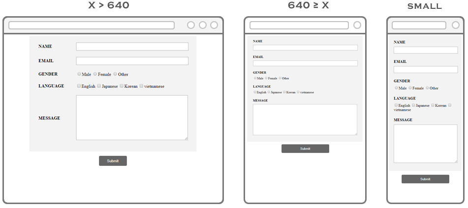
Click ví dụ responsive form với table dọc để xem kết quả.
Responsive form phức tạp
Đối với những form phức tạp khác, mà việc xử lý responsive khó khăn, thì ta sẽ áp dụng phương pháp giống với cách xử lý responsive của table phức tạp, tạo thanh scroll bar, tuy nhiên việc này không khiến khích, vì sẽ khiến người dùng cảm giác khó chịu khi điền form, cách tốt nhất là thay đổi giao diện riêng cho những màn hình nhỏ.